Your analytics team shouldn’t be a request queue. When your CMO, care lead, and commerce team each need a different view of performance, fixed dashboards create a bottleneck: someone pulls the data, reformats it, and rebuilds in a spreadsheet what should exist natively in the tool.
The problem isn’t that your team lacks analytical ability. It’s that most platforms are built around common use cases, and your reporting needs are rarely common. Your social team’s weekly review looks nothing like the competitive analysis your CMO needs for a QBR. Your care team wants response times and inbound social volume in the same view. Your commerce lead needs UGC engagement mapped to conversion, not three separate exports.
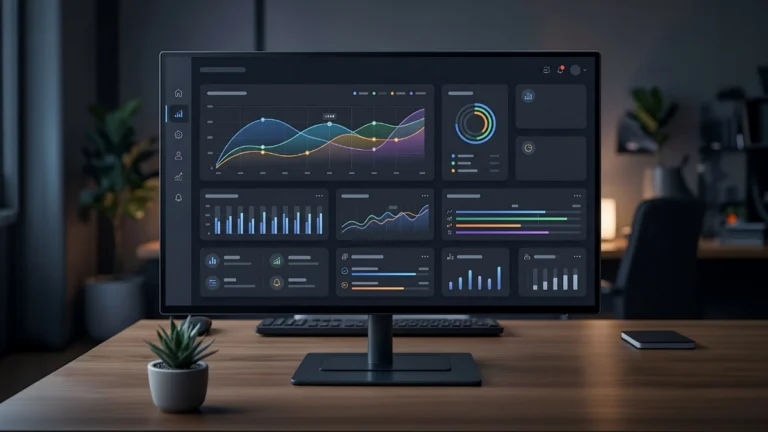
Dynamic Boards in Unified Analytics are built for exactly that: a fully flexible canvas where every team can build the view they actually need. Here’s what’s now available, and what’s changed if you’ve seen an earlier version.
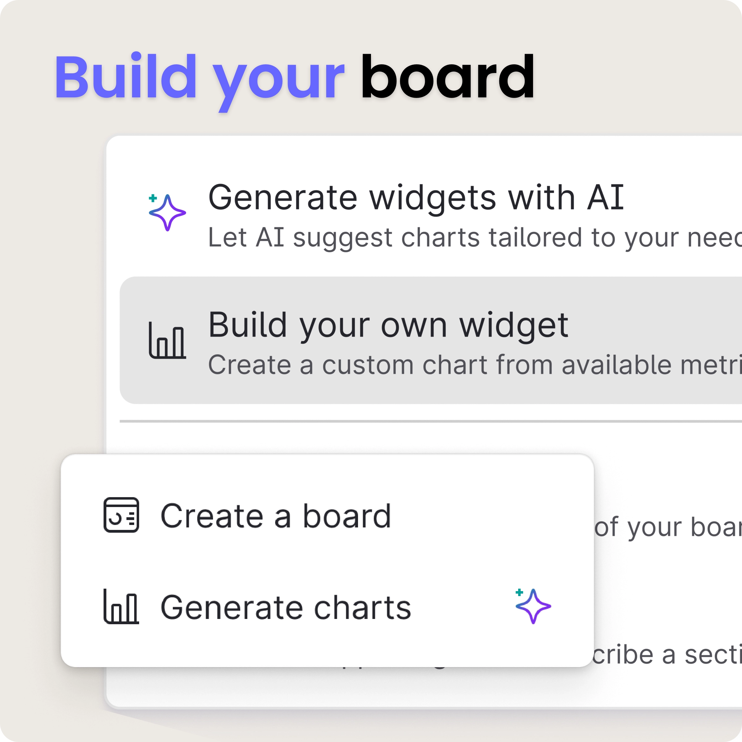
Option 1: Generate widgets with AI Widget Wizard, ask a question, get a chart

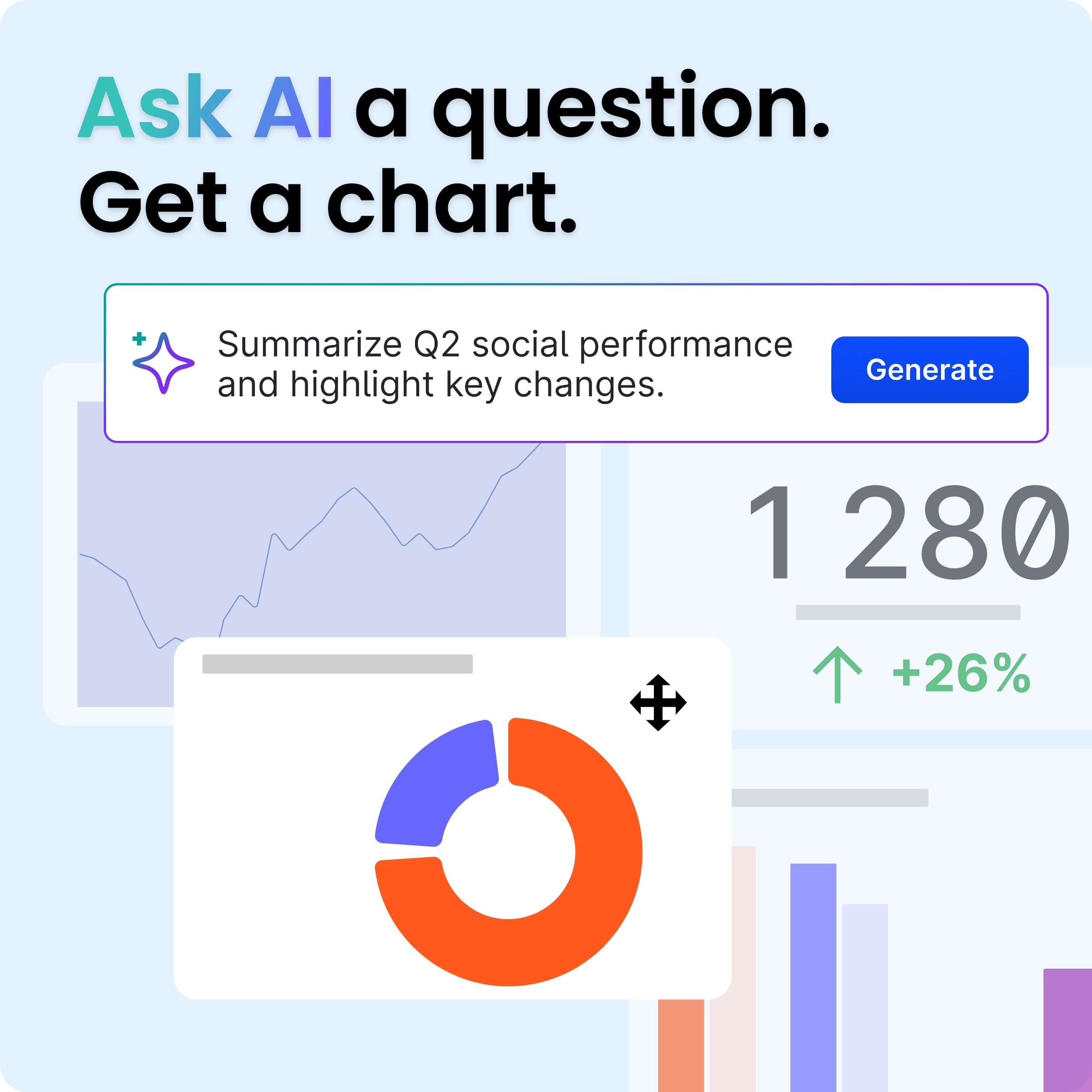
The fastest path to a new widget is to ask for one. Type a plain-language question, “Show me engagement by profile this month,” and Emplifi AI generates suggested widgets automatically.
Try the following routes:
Once generated, review the widgets, apply filters, and add the ones you want to your board. If the first result isn’t right, refine your question and regenerate; you don’t have to start over.

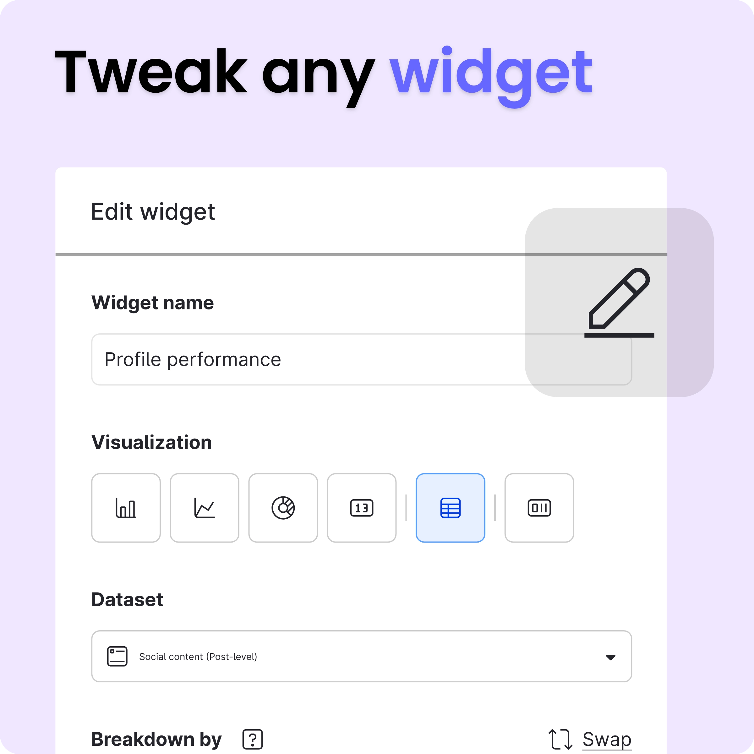
For teams who want precise control, Widget Editor Pro lets you build from the ground up. Click Add widget, then Build your own widget to open the configuration canvas.
Want to customize a widget that AI Widget Wizard built? Easily customize it with Widget Editor Pro to get full control.
From there, name your widget, select a metric type, choose your data sources, and configure visualisation type, aggregation, breakdowns, and filters.
Custom widgets can be added to any Dynamic Board, and once built, they can be duplicated, copied across boards, renamed, and edited at any time. Build something useful once; reuse it across every reporting context that needs it.

Boards are your working canvas. Add widgets from either path above, configure data sources, apply filters, and build out the view your team actually uses. All boards live in My Boards and can be shared across teams, so your CMO, your care lead, and your social manager can all work from the same analytical setup rather than maintaining separate exports.
The breadth of data sources available across a single board is worth highlighting: Dynamic Boards pulls from social profiles, paid, listening, community, and care data.
That means a Head of CX can build a single view that tracks social-driven care volume alongside response time and sentiment, without needing a separate tool or a manual data merge.
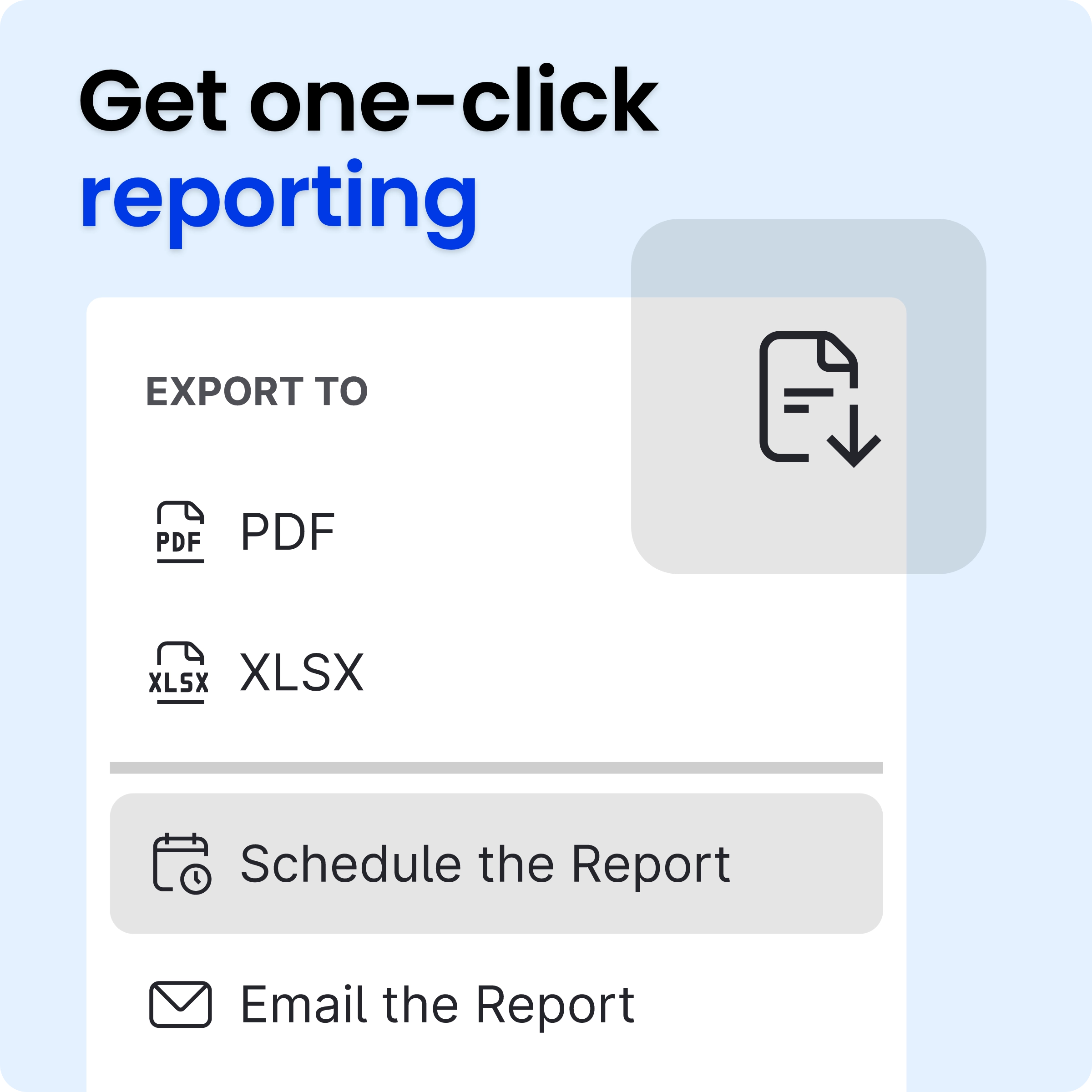
Once your board is configured, save it as a Saved View, a snapshot you can return to, share with teammates, or distribute via a schedule. This is the equivalent of what was previously a “Dashboard” in the legacy module, now living inside a platform connected to your full analytics dataset.

Saved Views mean your Monday morning report isn’t a rebuild; it’s a refresh. Set it up once, share it with the people who need it, and schedule it to land in inboxes automatically.
You don’t have to start from zero. The import feature copies your existing dashboards directly into the Unified Analytics structure, and widgets migrate automatically. You’ll then re-apply data sources and scheduling, and you’re set.
Path A: Unified Analytics
Path B: Fuel AI
Path C: build from scratch:
Every team has a different definition of useful analytics. Dynamic Boards gives you the canvas to build it — whether that’s a cross-channel performance view for your CMO, a care and social overview for your CX lead, or a weekly reporting setup your whole team actually opens.
It’s part of Emplifi Unified Analytics: one platform that brings together social, paid, listening, community, care, and commerce data so your reporting reflects how your business actually works.