TikTok isn't just a place where new Gen Z lingo is invented or dancing trends created by teenagers go viral. It's also a social media platform that holds promise for businesses and marketers looking to tap into a growing audience of consumers. With over a billion active users, TikTok has seen tremendous growth at a rate much quicker than its peers like Facebook and Instagram.
In addition to organic video posts to drive community on TikTok, brands continue to embrace its ad platform. It stands to reason that marketers and agencies have begun to study the platform to understand how they can benefit from the massive user base it boasts. If you're looking to advertise on TikTok, you'll need to know the specifications and safe zones they have defined for sponsored posts.
In this article, we'll take a look at ad specs for TikTok, why platforms define these specifications, and how you can create video ads that are well-integrated with the platform without cutting off or blocking important elements of your video.
Why ad specifications exist
Every social media platform has its own specifications for ads and creatives. These are defined so that users and businesses know how to create posts that suit the platform based on how it serves up content on screens.
It is essential that you follow these specifications when you create a post on any platform. This ensures that your posts look good on social media sites, that no elements are cropped out or invisible, and that the algorithm can gather what it needs to about your post.
TikTok video ad specifications
There are a few different ad locations and types on TikTok.
Barring a couple of elements like the orange call-to-action button and "sponsored" text, the majority of TikTok ads have almost the same layout as organic TikTok videos. Download our safe zone templates below to share with your brand team when creating a video and ensure that main parts of your video like captions aren't covered by the gray areas. More on these aspect ratios later.
9:16 TikTok Safe Zone Template

16:9 Safe Zone Template

1:1 Safe Zone Template
Let's take a look at what the different types of ads are and the specifications for each of them.
In-feed TikTok ads
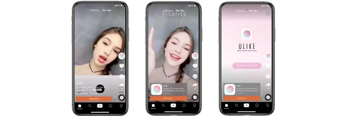
In-feed ads, as you might imagine, are ads that users see as they're scrolling through their feeds. They arrive at this feed by navigating to the "For You" page. Since these ads are integrated with the feed, it's easy to grab users' attention and drive engagement through comments and likes.
This holds true especially for brands creating ads with an authentic feel or featuring user-generated content (UGC). These types of videos are more likely to blend into the For You page naturally without sticking out like an obvious advertisement.
This is what an in-feed ad looks like on TikTok.
Source: Cyberclick
In-feed TikTok ad specifications
Aspect ratio: 1:1, 9:16, or 16:9
Dimensions: 540*960 pixels, 640*640 pixels, or 960*540 pixels
Duration: 9 - 15 seconds recommended by TikTok; 60 seconds maximum
File size: Under 500 MB
Barring a couple of elements like the orange call-to-action button and "sponsored" text, the majority of TikTok ads have almost the same layout as organic TikTok videos. Download our template below to share with your brand team when creating a video and ensure that main parts of your video like captions aren't covered by the gray areas.
Brand Takeover TikTok ad
A brand takeover ad is a more assertive means to have your ad seen on TikTok. This ad type appears as soon as users open the app in the form of a gif, video, or image. The creative takes over the screen for a few seconds (hence the name) and then transitions into an in-feed ad.
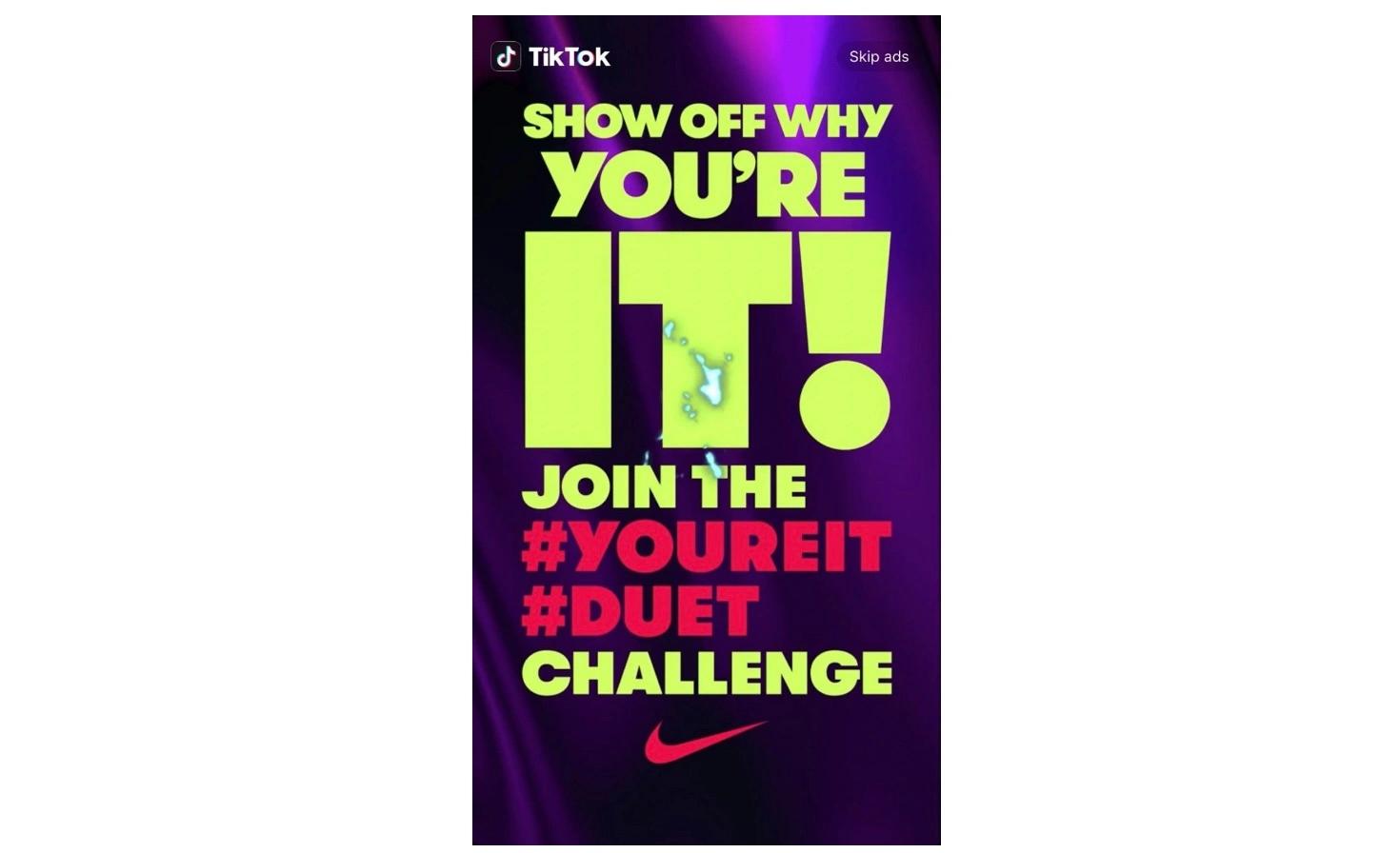
Source: Contagious
Brand Takeover TikTok ad specifications
Image filetype: PNG/JPG
File Size: Under 50 KB
Aspect Ratio: 1:1, 9:16, or 16:9
Top View TikTok ad
A top view TikTok ad is very similar to a brand takeover ad. The main difference is that instead of taking over the screen as soon as someone opens the app, a top view ad appears three seconds after a user starts viewing their in-feed posts.
Top view ads are full-screen ads and they play automatically. You can include a call to action button within the ad. They do break the user's experience though, so they don't feel as organic as an in-feed ad.
Top View TikTok ad specifications
Aspect ratio: 1:1, 9:16, or 16:9
Dimensions: 540*960 pixels, 640*640 pixels, or 960*540 pixels
Duration:60 seconds maximum
File size: Under 500 MB
Branded hashtag challenge TikTok ads
Branded hashtag challenges are a great way to drive engagement among your user base in a fun manner. These ads allow you to create a hashtag for your brand under which users can post their own content to win challenges.
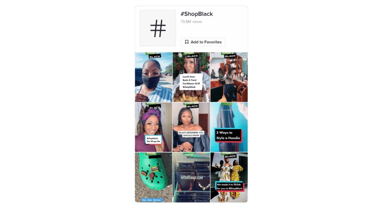
Source: Tribe Group
These kinds of ads are way more engaging than the average in-feed ads. In addition to generating brand awareness on TikTok, your brand also has access to a ton of UGC which you can then leverage for other marketing campaigns. For example, embroidery brand DMC features TikTok content from its community both on the brand's social profiles and on a dedicated, shoppable website gallery built with Pixlee TurnTo.
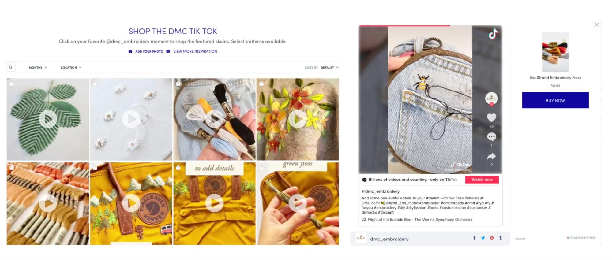
Branded hashtag TikTok ad specifications
Aspect ratio: 1:1, 9:16, or 16:9
Dimensions: 540*960 pixels, 640*640 pixels, or 960*540 pixels
Duration: 9-15 seconds recommended by TikTok; 60 seconds maximum
File size: Under 500 MB
How to choose a TikTok ad aspect ratio
At this point, you're probably wondering how to decide which aspect ratio you should choose for your TikTok ads. Here are a few pointers that can help you make that decision.
9:16 aspect ratio
This is the aspect ratio of your average smartphone screen. And for that reason, it's the aspect ratio you should stick to when creating ads for a mobile-first platform like TikTok.
The only thing that you need to keep in mind when creating an ad in the 9:16 aspect ratio is to center the key elements according to our safe zone template mentioned earlier. This will ensure that none of the other native buttons or icons like profile picture overlap with your content.
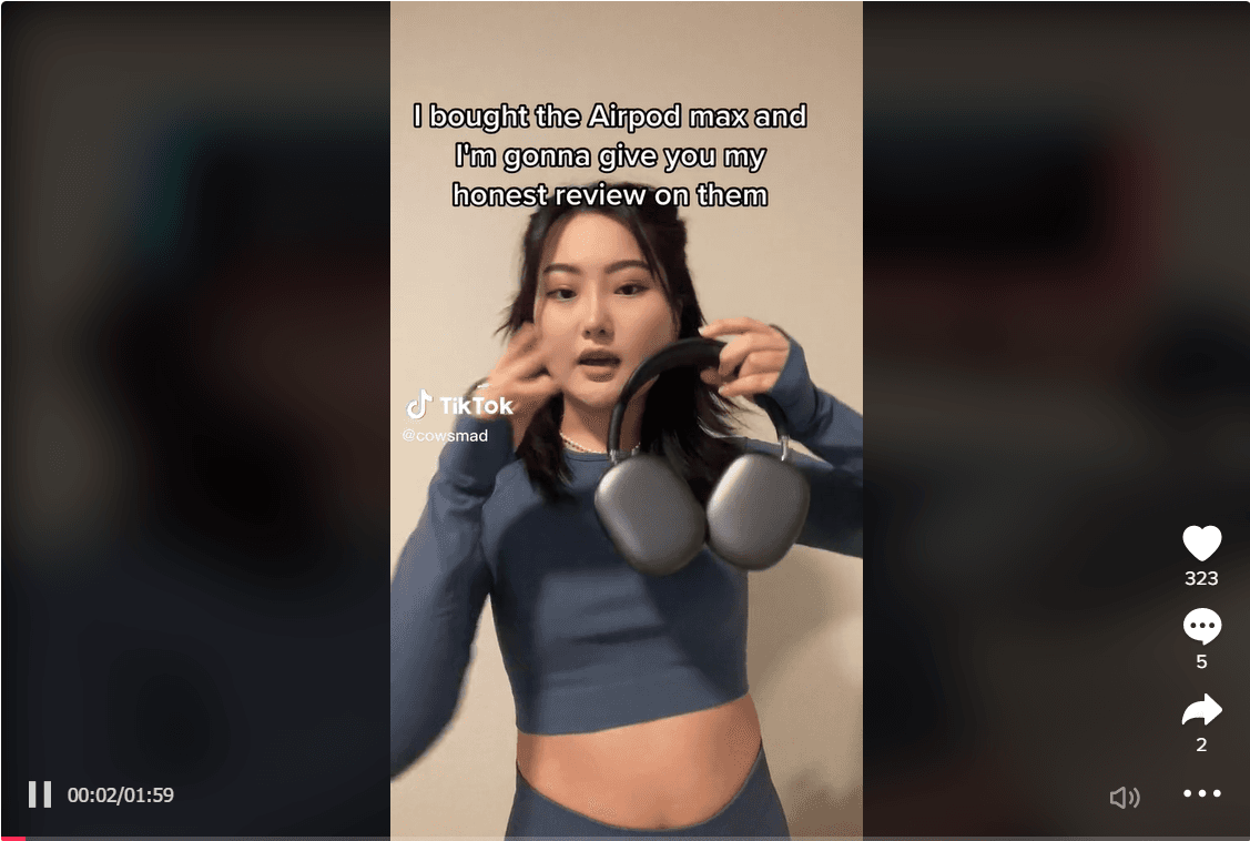
In the less probable event that your TikTok is being viewed on a desktop, the 9:16 aspect ratio will appear like this and as the comment and share buttons are not over the video screen there's no real obstacle to information visibility. However, centrally positioned elements still help in grabbing user attention as can be seen in the TikTok that reviews AirPods by creator @cowsmad.
16:9 aspect ratio
This is the aspect ratio of the landscape mode, which is when you turn your phone over to its side. You're asking mobile users to take the action of turning their phones to the side when you create a TikTok ad in the 16:9 aspect ratio.
Although that can be a hindrance to some users, creators sometimes use this aspect ratio because it is the more cinematic and spacey option. Elements in your video are magnified and it's easier to create more dramatic effects.
An important thing to remember is that when you create an ad in the 16:9 mode, the caption will be to the right of the video, and the like, share, and comment buttons to the top. So create your video in such a way that those elements don't clash with the viewing experience using our safe zone template for 16:9 videos. That said, TikTok is experimenting with a native landscape viewing mode and that may make it easier to deliver videos in the 16:9 aspect ratio.
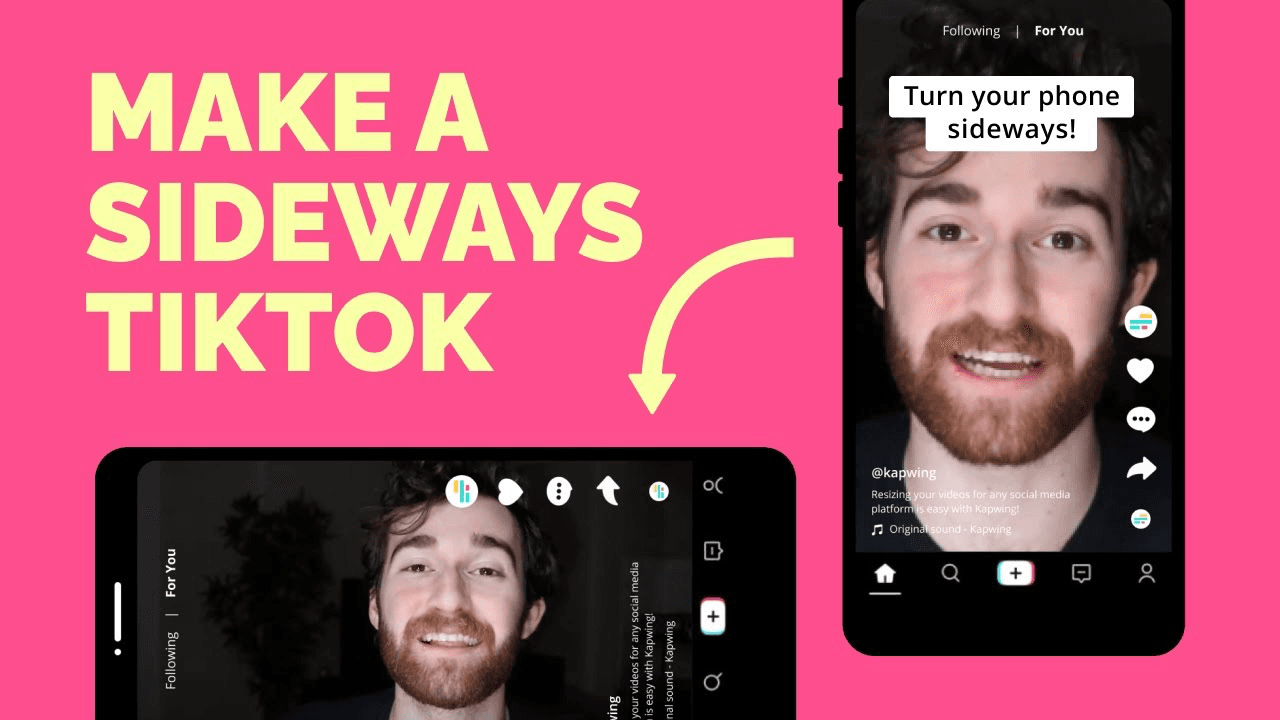
Source: Kapwing on YouTube
1:1 aspect ratio
The 1:1 aspect ratio produces content in a square shape. It is not recommended that you use this aspect ratio for video ads on TikTok as the 9:16 aspect ratio is a better option. But you might consider going 1:1 for images since they don't contain moving elements as videos do. TikTok's "photo mode" allows users to create carousels of static photos that can be swiped through by viewers, and some of these videos use a 1:1 format.
TikTok ad best practices and tips
We now have a good idea of what the specifications are for different ad types on TikTok. Let's now take a look at how you can create ads (and organic posts!) to maximize engagement on the platform and reach your desired audience.
Limit video length
We've seen that there are ad formats that allow you to create videos that are as long as sixty seconds. Organic TikToks can even be up to 10 minutes long. Although it's nice to have that much room, it's ideal that you keep your videos down to between nine and fifteen seconds in length, or you'll risk losing your viewers' attention.
Some types of informative videos, particularly ones requested by brands or certain collaborations where influencers will promote a given product, can be longer and still perform well. For example, this TikTok on house sitting is part of a branded hashtag challenge and gives detailed info on how to use the Trusted House Sitters app. The time limit on this is still capped at 50 seconds - just under a minute.
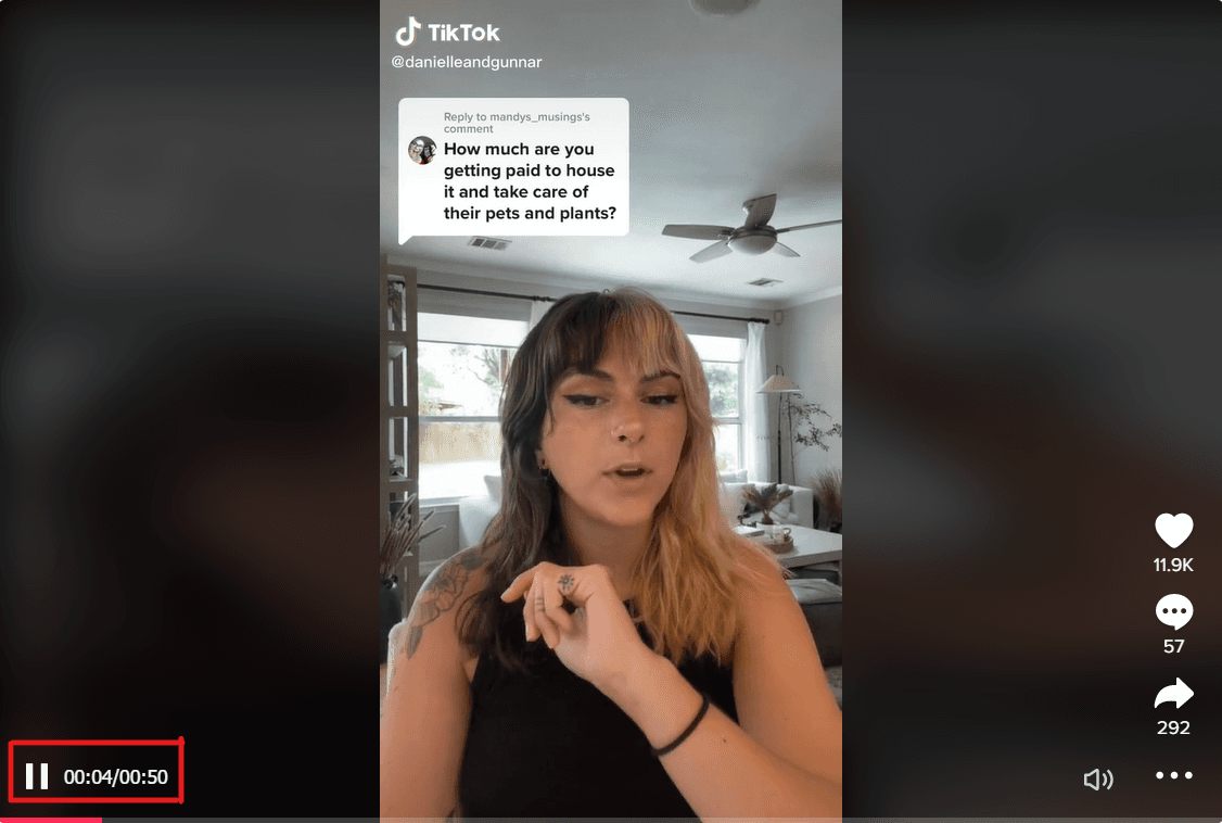
The main reason for this is that TikTok as a platform shows a preference for short videos. It's unlikely that your audience will want to sit through an ad that's a minute long, so you need to try to get your message across in about a fourth of that time ideally. The whole point of short-form video is to present bite-sized information and entertainment for users.
Create vertical videos
It used to be that videos were created in landscape mode for screens that were oriented that way. But platforms like TikTok have changed that with their mobile-first approach to content.
What that means for businesses is that you need to start creating vertical videos regularly for TikTok and other such platforms. This could mean shooting all your videos on a phone or editing landscape videos so that they can be consumed in the vertical format. Shooting videos on a smartphone isn't a bad idea; most UGC is created on phones and customers tend to trust it more than traditional brand content.
Make an impact early
This point is a corollary to the one about limited video length. You have only a couple of seconds to grab the attention of users on TikTok. If you don't, they will scroll away from the video and not complete the call to action.
Now there are a couple of ways that you can go about making a quick impact on a viewer. The first is by writing copy that quickly shows the viewer that they're watching something that is highly relevant to them. The other option is to create imagery that grabs their attention and forces them to keep watching. You can also include soundtracks from TikTok's libraries of royalty-free music which can keep viewers listening for slightly longer periods of time.
Position key elements centrally
The TikTok screen is one that is crowded with a lot of different elements. Even if you're just scrolling through your feed, you're going to see the name of the account, the like and share buttons, the video caption, and so on.
To avoid having your content obscured by all those elements, make sure that all your main content is positioned centrally in the video. This will ensure that viewers see everything you want them to see and are more likely to engage with the given call to action.
A good example of this is mail-order mattress company Sleepjunkie's TikTok affiliate marketing campaign. The most important elements such as the deadline and reward are centrally positioned on the screen, making the most out of the 9:16 aspect ratio.
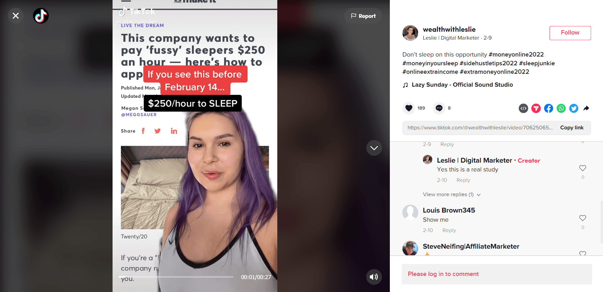
So there you have it! Whether your brand is looking to break into the short-form video space or simply uplevel its organic TikTok strategy, having these ad specs in the back of your mind is always helpful. Once you begin to create videos for your brand or share UGC from your community on TikTok, consider repurposing that content for other platforms like Instagram Reels. And remember to center your video elements!
Editor's Note: This article was originally published on pixlee.com. Any statistics or statements included in this article were current at the time of original publication.


